

The four colors were chosen to reflect luxury and elegance while honoring the company’s namesake:
A muted royal blue evokes both nobility and the ocean
A rich gold recalls sunlit beaches
An off-white suggests desert sands, nodding to Ocean’s Qatari roots
And black, a timeless symbol of elegance, grounds the palette and lets the other tones shine.
Important note: The Ocean logo existed prior to my employment, so I designed this entire project around it
Concept
This design system embraces elegance through a refined and balanced color palette that evolves with the seasons. It’s intuitive by design — welcoming new users with visual harmony and seamless transitions. Colors shift rhythmically across the year, with each season blending hues from the one before and the one ahead, creating a sense of continuity that feels both natural and intentional.
-
Madame Badreah, my supervisor, emphasized that elegance should be at the heart of Ocean’s identity. In response, I combined minimalist principles with refined, elegant details to create a visual language that feels both elevated and approachable. The result is a system that reflects Ocean’s values while remaining clear, cohesive, and flexible.
-
Knowing my time at Ocean would be limited, I aimed to create a system that could thrive without me. It needed to be self-sustaining — something intuitive enough for someone new to pick up, understand, and execute with ease. By building with clarity and rhythm at its core, I hoped to leave behind a design language that was not only elegant, but enduring.
-
I wanted to create a system that evolves throughout the year while maintaining a strong, consistent identity. As a smaller brand, Ocean doesn’t have the flexibility to frequently reinvent its visuals — so instead of static branding, I built a rhythmic, seasonal color scheme. By subtly shifting the palette across the year, the system stays fresh and engaging without losing its core character.

My idea here was that they would see the thumbnail on the profile, and when they clicked on it, they would see closeups of the material. I wanted to make sure that you could browse and window shop from the comfort of the Instagram page. I used the studio photos provided by the manufacturer so that they could have a high quality viewing experience to make deciding interest much more streamlined for the consumer.
Each new quarter introduces a color combination that blends one shade from the previous season with a new one, ensuring smoother, more cohesive transitions.
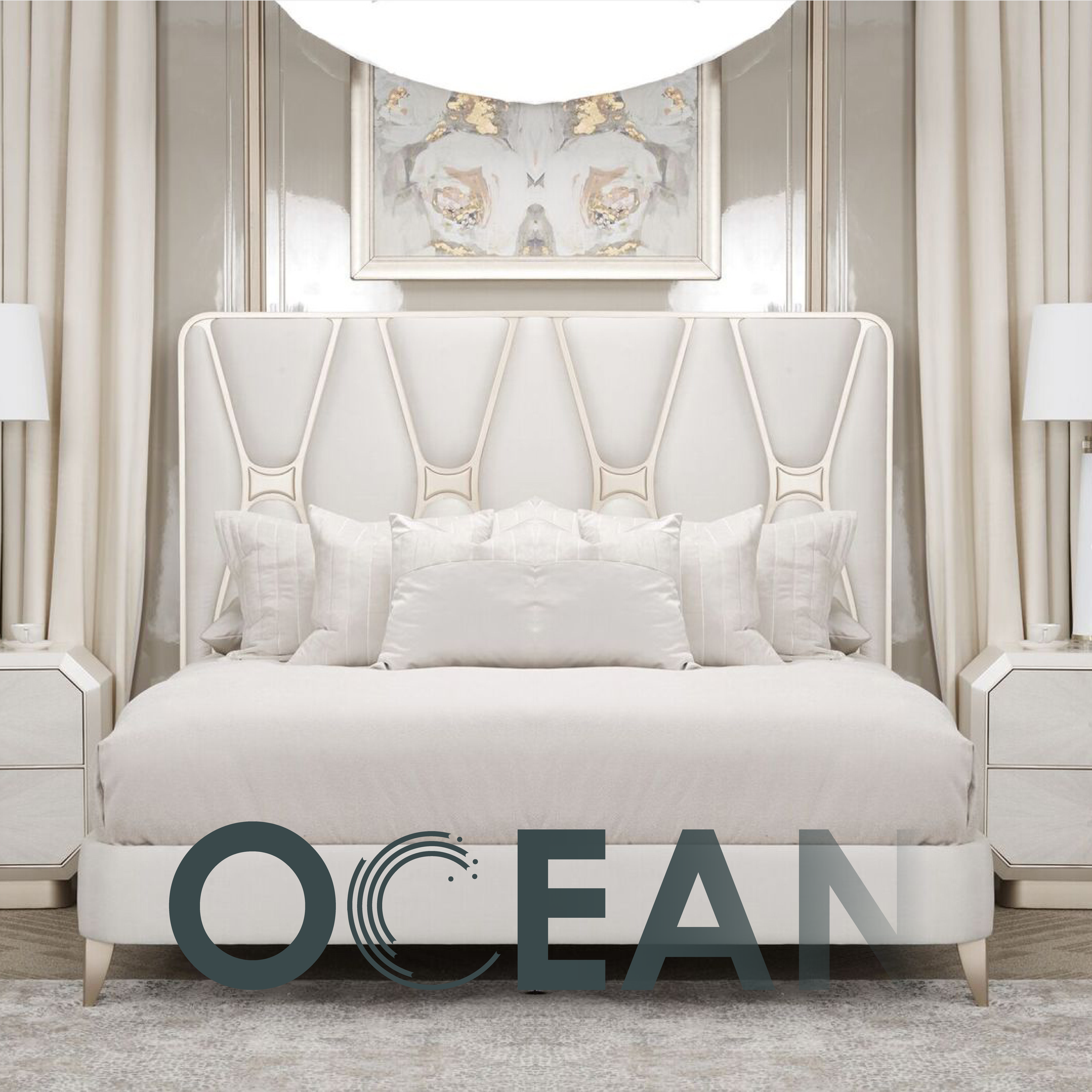
During my employment at Ocean, I was assigned to create a new style guide concept for the Ocean Instagram page since there is no branding or distinct style present for the page. I wanted to create a ‘seasonal’ style that would change as the months did. Utilizing 4 colors that I felt really embodied Ocean’s elegant brand. The logo was already designed before I started working there, so I also designed around it
-
![]()
Thumbnail/ Cover
-
![]()
Expanded Cover Image
-
![]()
Studio picture with logo superimposed
-
![]()
Second studio photo
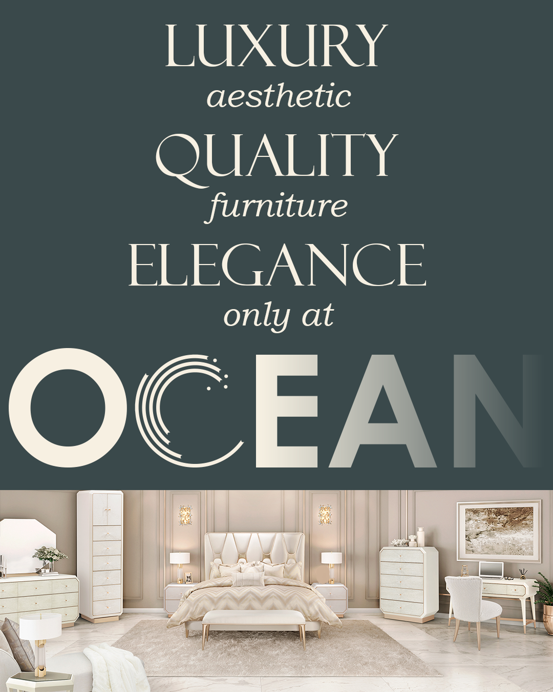

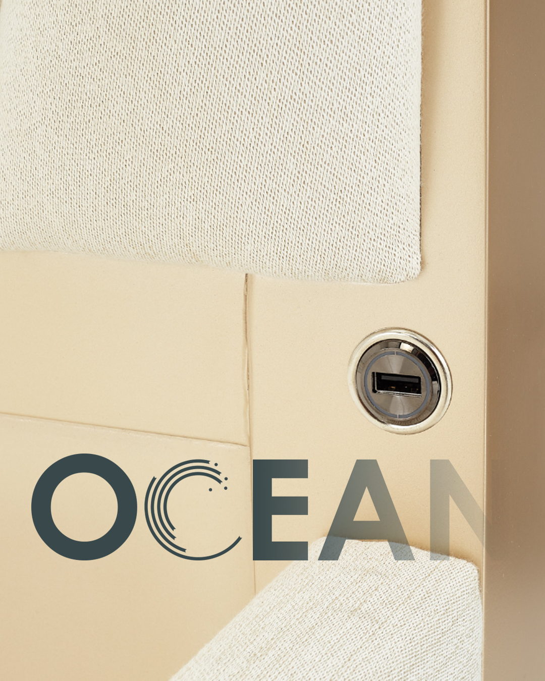

The thumbnail was designed to embody Ocean’s elegance and showcase its distinctive aesthetic. Its purpose was to entice viewers to click and explore further. Once engaged, they would see an expanded view, followed by detailed macro photos highlighting the furniture’s materials and craftsmanship. I intentionally withheld individual product photos to encourage potential customers to visit the physical store — a strategy aligned with Madame Badreah’s preference for in-person business. This approach offers just enough visual appeal to spark interest while maintaining the incentive for a store visit.